 |
| © 2012 Brianna da Silva |
This tutorial is an example of
combining Bryce and Photoshop to create an image. (By the way, if you're interested in 3D design and Bryce, the software makers are
offering it for free for a limited time!) The concepts in this tutorial can be applied to the creation of many other Bryce/Photoshop images.
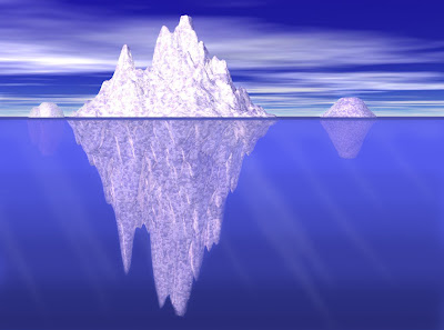
I wanted to make an image something like these pictures (these were just random photos and drawings I pulled off the Internet):


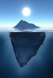
I wanted the classic tip-of-the-iceberg picture, showing the rest of the iceberg underwater. How would I go about making this, I wondered? I knew that Bryce did not have a split-screen, half-above/half-underwater capability. In Bryce, you're either above water, or you're underwater! So, I decided to use a
combination of Bryce and Photoshop (mostly Photoshop) to get the effect I wanted.
Phase 1: Bryce
Step 1: Above water
First, I created the above-water image of the iceberg. I did this by creating a lattice (
learn more about lattices in a former post), which I made really big so the details later would look more realistic. (General rule of thumb: If the object you're making is big in real life, make it
big in Bryce!)
I gave the lattice the
iceberg material (go figure!).
Then, I created a water plane, and moved the lattice down so it was roughly halfway "submerged" in the water.
I gave the water the material called
deep blue.
I also gave the sky a preset called
The Big Deep for lighting purposes. (Mostly so the water would look dark blue, which didn't really matter anyway.)
Next, I duplicated the lattice a couple times, making smaller icebergs in the distance, just for variety in the picture.
I made these icebergs a little rounder-looking, by first opening the
Edit window (found by clicking the
E that appears next to an object when it is selected), clicking
New under "Editing Tools", and drawing a rough, blobbish shape with the paint tool.
For a more detailed guide on editing terrains and lattices, I recommend
this tutorial. A couple things to keep in mind: In the tools on the left, you can change the size and softness of the brush (I used a big brush with medium softness), and you can adjust the
elevation of the brush with the slider. The higher the red dot, and the
lighter the color of your brush, the higher it is; the lower the red dot, and the
darker the color of your brush, the lower it is.
Finally, I got my view where I wanted it -- just about level with the water line -- and rendered. This was the image I got:
Step 2: Underwater
The next step was to create the underwater view.
First, I saved the document as a new project, so I wouldn't loose my first work. Then I deleted the water plane, moved the icebergs up and zoomed out so I could completely see them, and stretched and enlarged them so they would be bigger than their above-water counterparts.
I used
this tutorial, found though googling, to change the atmosphere so it had the allusion of being underwater.
This was the result: (Ignoring the cloud and sky; that wouldn't be used in the final image)
Later, I also temporarily removed the icebergs and rendered an image of just the "underwater" scene (I found out, while working in Photoshop, that I would need it):
Phase 2: Photoshop
Now the real work began! This phase took more time, by far.
Step 1: Basic image
I used the
marquee tool in Photoshop to copy the underwater portions of the iceberg, and then paste them on the above-water image.
Using the marquee tool again, I took the plain underwater image (without the icebergs) and put it
behind the underwater iceberg layers, to fill in all the gaps. (Learn more about
Photoshop layers here.)
I erased the water around the underwater iceberg layers, stopping right at the edge of the ice.
Step 2: Dark line
I added a dark blue line at the edge of the water, to make the edge look sharper and a little more realistic.
Tip learned: Hold down the shift key while painting, to paint in a straight line!
Step 3: Light rays
My brother suggested I try making light rays in the water, so I gave it a try.
I chose a soft brush, gave it a white color, and painted diagonal streaks in the water. I gave the light ray layers a very low opacity (8%), and used a soft eraser to taper the streaks to a point.
Step 4: Darkening water
I made the water get darker as it went further down by painting horizontal streaks, using a soft brush, and making the color just slightly darker with each stroke. The result was a smooth, subtle transition to a somewhat darker blue.
At last...
Finally, as a sort of small, side adjustment, I darkened the horizon a little by painting a light gray layer with a low opacity.
The picture still wasn't perfect. The water probably should have been darker, and the iceberg ended up with a strange purplish hue (probably a poor choice of lighting... lighting in Bryce is next on my list of things to learn!). However, the result was more or less what I imagined. Regardless, it was a fun example of how a Bryce image can be completely transformed in Photoshop!
The final image:
 |
| © 2012 Brianna da Silva |


