
For my Full Sail classes, I've had a couple assignments to create realistic mechanical objects in Adobe Illustrator. The above camera, for example, was my recent assignment. Before that, I also made a cork screw (below).


That's a lot of lines, right?? Don't worry, I will teach you how to do everything. This tutorial will be the first of an ongoing series on the tools I used to create these realistic illustrations. So grab a photo reference, open up Adobe Illustrator on your computer, and get ready to make amazing digital art!
Starting out
The first step for making any illustration in Adobe Illustrator is to block out the main shapes of your object, using the pen tool. (If you've forgotten how to use the pen tool, or have never used it before, refer to my previous tutorial.)
 |
| The photo you see behind this was my photo reference. It's helpful to have a photograph underneath your layers as you work so you can make your shapes proportional. |
After you've made all your big shapes, start pen tooling the smaller details. Use the eye dropper tool to fill in your shapes with colors from the original photo.
However, with nothing but shapes and colors, your picture will not look very realistic. It may be a nice illustration, but it'll be a far cry from photorealism. That's when you start using the tools in Illustrator to make your object come to life. In this blog post, I'll introduce you to the most useful tool for illustrating mechanical objects: gradients.
Using gradients
If you look at the completed camera at the beginning of this blog post, you'll see that most of it consists of gradients. While gradients are probably the simplest of the tools I'll show you, they're also one of the most powerful, especially with mechanical objects (as opposed to organic objects).
Because of their perceived simplicity, gradients are probably overlooked in light of the more complex tools (such as gradient meshes, which I'll teach you in the next tutorial). But, I encourage you to really use gradients to their full potential. As my instructors used to say, a simple gradient goes a long way.
 |
| Here, I started to add some gradients. I still had some smaller details to add, though. |
 |
| More gradients and details... |
Now, I'll show you how to use gradients. First, open up a new Illustrator document and create two rectangles. Remove the strokes on both of them and fill them with whatever color you like.

Then, save this color by going to your swatches panel (if it's not open, bring it up by selecting Window --> Swatches) and clicking "New Swatch."

This window will open. Click "OK".

Your color will now be saved in your swatches panel. (We'll come back to this later.)

Now that your color is saved, select one of your rectangles and click the "gradient" button on the toolbar.


Now your rectangle should look like this.


Also, you may see a bar appear across your rectangle (for some reason, this bar was not visible in my screenshots). If the bar doesn't show up automatically, it can be accessed with the G key on your keyboard. Moving this gradient bar around will allow you to change the angle of your gradient. You can also change the angle with the drop-down menu on the gradient panel.


A few other things you can change. The gradient panel has a drop-down menu that allows you to change the gradient from "linear" to "radial". Radial is great for round shapes (although it looks a little awkward with our boxy shape).


For this example, I'm going to keep my gradient linear at its original angle measurement. But you can do whatever you like.
There's a problem with this gradient. It's black and white, and that's not what we want. We want it to be blue.
Go back to your gradient panel and double-click on one of the pointy box sliders underneath the gradient preview. This will bring up a new window where you can change the color.

Right now you're in the "color" window. Switch over to your swatches.

From there, select the color you saved earlier. Or, if you've changed your mind, pick any color you like.


Now, click on the other slider and make it the same color. It'll make the gradient look like one solid color again, but that's okay.
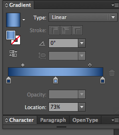
Click underneath the gradient preview, toward the middle, to create a new slider.

Double-click on it again. This time, switch over to "color".

Use the drop-down menu in the top right corner to make sure you are in HSB mode. HSB mode is the best mode for adjusting colors to look like natural highlights and shadows, which is what we are about to do.

Move the middle slider to the left to make a lighter color. Now your gradient has a highlight.

Change the color of the other two sliders to a darker blue. The best way to do this is with the bottom slider in HSB mode.

See, the rectangle on the right is already looking so much more rounded and three-dimensional than the rectangle on the left. There are still things we could do to tweak it, though. For example, the highlight in the middle is far too harsh; it could be smoothed out a bit.

We can do this by moving the little diamonds above the gradient preview.

Much better!

There's a lot you can do to adjust a gradient and add more detail. You can add more sliders, move them around, and experiment with changing their colors. (If you need to delete a slider, simply click the trashcan next to the gradient preview.)
 |
| Kind of looks like a metallic shine... |
For a different effect, try alternating between lighter and darker colors to create a rippling texture. If a gradient just isn't working for you, you can always try adjusting the angle or switching between linear and radial.
That's the gist of gradients; play around with it and see what you can come up with!
Taking gradients to the next level with Illustrator's most infamous tool: gradient meshes.