Monday, November 19, 2012

How to use the pen tool in Illustrator

Today I have a video tutorial for you on how to use the pen tool, one of the most essential tools for digital illustration within Adobe Illustrator. Enjoy!


EDIT:

After making this video and learning more about the pen tool, I realized that I was doing something wrong in this video. You see me clicking on points as I make them to delete one of their anchor points. I never explained why I was doing this, but it was so that Illustrator would allow me to make larger, more flexible curves.

DON'T DO THIS!

While deleting anchor points does give you more flexibility, it also limits the smoothness of your curves, and creates "kinks".

This is an example of an illustration I made - can you see the kink? One side of the flame is very smooth; the other side has a jagged angle.

You don't want your illustrations to look like this!! :-)
Only delete anchor points if you want a jagged angle like that, if you're making a sharp corner or point. (For example, the tips of the flames in the above illustration.) If you're trying to make smooth arcs, practice making more points and smaller curves. This will eliminate the problems that come with making curves that are too large.

A word of caution: Don't use too many points. You want enough that you can make your shapes look natural, but you don't want any more than you need. The more points, the larger the file size. Just something to keep in mind.

Well, now you know how to do it correctly... so, happy pen-tooling!

Monday, November 12, 2012

A Tale of Two Chocolates


Once upon a time, there were two packages: Package Modern, and Package Exotic. These packages contained the exact same ingredient: Organic cacao powder. However, not all organic cacao powder packages are created equally. These two rivals each told a different story.

Package Modern, as indicated across the top of his groovy bag, tried to appeal to the "modern lifestyle"; to busy moms and families seeking a powerful health boost as they rushed between sports practices, classes, and workouts at the gym. His appearance shouted a message loud and clear, even if his beholders only perceived the message in their subconscious: I am modern; I am pure. The plain block shapes, the basic sans-serif fonts, the limited color scheme, and the simple silhouette illustrations all contributed to this message.

Package Exotic whispered another tale. Her design spoke of other lands, sparking connotations of places rustic and wild. The loose "Dagoba" title, the strong serif fonts, the seemingly stained and ripped banners, the calm and earthy color scheme, and the faintly seen, elegant, detailed illustrations all suggested a message of exotic value, as if the contents were obtained through careful trading with natives in a country far away. Package Exotic invited her beholders to travel to an adventurous place of their imaginations, and to partake in something old and clean of unhealthy modern pollutants.

Two packages told a different tale, yet each had the same audience and the same mission: To convince a consumer to purchase one of them, and not the other. Which package design do you think was successful?

If you were walking through a store, which would you buy?

Monday, October 22, 2012

Graphic Design Nails

Frequently, a well-executed design stands out to me. A couple weeks ago, I was especially struck by the cover design for David Platt's book, Radical.


The powerful simplicity of the overall design and the irresistible, bold colors inspired me to do something a little "radical" myself... to paint my nails according to the book's design! And so, I'm doing something a bit unconventional for this blog, by sharing with you how I turned a book design into a nail design.

Step 1: After applying a protective undercoat, (any clear nail polish works), I painted my nails a solid orange color.


Step 2: I painted a black band at the tips of my nails, resembling the band that runs across the top of the book cover.


Step 3: Using toothpicks to achieve the minor details, I added the shape of the upside-down house in white, then applied an orange dot and orange line to represent the window and door.


Finally, I added another layer of clear nail polish as a protective topcoat, giving my nails that glossy, shimmering look.

And that's it! Here's the final result:


A closer view of the nails:


Is there a book cover design that you really like? Comment below!

Tuesday, October 2, 2012

Art History


I know this isn't exactly a "digital art tutorial", but having a knowledge and understanding of art history is important even for digital artists. It's also incredible for inspiration. Already, reading the textbook for my Art History class has given me so many ideas for digital pictures and models to create, both of a purely historical sort and a fantastical sort... (if only I knew the software well enough to produce them!)

Here are just a few random, miscellaneous things I've learned so far in Art History:

* Post and lintel architecture consists of two upright beams with a beam sitting on top. Stonehenge is an example. Some doorways were also formed this way.

* In Ancient Egyptian art, people were portrayed in stiff, unnatural poses. Heads were in profile; eyes are seen from the front; shoulders were seen from the front; and legs were in profile, with one foot in front of the other.

* A relief sculpture is partially carved out of its background material. ("Whew, what a relief I don't have to carve the whole thing!") A sculpture in the round is entirely carved out and free-standing. (You can walk all the way around it.)

Example of a relief sculpture
Example of a sculpture in the round

* In Medieval Spain, the combination of Christian and Islamic influence resulted in a style known as Mozarabic. 

* Ottonian art consisted of many carvings made from wood and bronze. The name "Ottonian" came from the rulers of that time, Otto I, Otto II, and Otto III. (That's a lot o' Ottos!) (Say that aloud three times fast and you'll see how brilliant I am. Okay, okay... it's not actually very funny. I'll go retreat into a nerdish corner now.)

* In the Romanesque period of art in Europe, many beautiful castles and churches were built. Some churches would have columns with zigzagging "v" patterns called chevrons.

Chevrons (image from paradoxplace.com)
* Some common features of Medieval churches:
(a) Mosaics on walls
(b) Stained glass
(c) Domes
(d) Political as well as religious functions
(e) Used as a site for pilgrimages

Medieval church with stained glass
Now, I want to hear from you! What are some aspects of art history that inspire you? What is your favorite historical piece of art? Do you know an interesting snippet of art history that you'd like to share? Or, do you have any other comments related to art history? Answer one or all questions in a comment below!

Saturday, September 29, 2012

Photoshop Cave Painting

Today I finished my first digital art assignment at Full Sail University. For my Art History class, I was assigned to make a "prehistoric"-style cave painting in Photoshop.


This activity taught me a few things about Photoshop. I'll briefly show you how I made the rock wall, added texture, and created a light source.

1. Rock Wall

First, open a new document in Photoshop.


Then, set your foreground and background colors to a light and dark color for your rock wall.


Go to Filter, Render, and select Clouds.


To add a touch of realism, add some noise.


2. Add Texture

Switch over to channels.


Create a new channel. It will be called "Alpha 1". 


Go to Filter, Render, and select Difference Clouds. Then, continue to select Difference Clouds until you get a pattern you like.


This texture will be applied to the rock wall in a second; but first, we need to add a light.

3. Light source

Switch back over to layers. Then, go to Filter, Render, and select Lighting Effects.


This cool lighting tool will then come up. You can adjust the size of this light, its intensity, its shape, its color, and more, until you get it to the effect you want. 


Then, before you hit "okay" on the light, go to the properties panel, click on "Textures", and select "Alpha 1."


You will then have a very rocky-looking texture from your Alpha 1 channel. You can adjust the height to make it very subtle, or very rough. Play around with it and see what you can make!


Moving to Full Sail


It's been a while since I've written, but much has happened. My passion for digital art has advanced from a mere hobby to a serious degree major. This November, I am moving to Winter Park, Florida, to study Digital Arts & Design at Full Sail University. I have already started online course work in advance, and I am stoked the skills I will learn in graphic design, web design, motion graphics, animation, 3D arts, and more.

What does this mean for you? Well, firstly, lots more information I can share on this blog! Secondly, however, I will be very busy with Full Sail's incredibly fast-paced, accelerated program, and I'm not sure how much time I will have for blogging. But I will try to post on here as much as I can, and share some of what I learn so you can walk this journey with me. I hope to see you along the way!

Me visiting the Full Sail campus in June, 2012

Wednesday, July 4, 2012

Photography Tutorial: Shutter Speed & Motion

Canon EOS Rebel T3i digital SLR camera. Picture from retx.net.


I recently made the exciting purchase of a Canon EOS Rebel T3i digital SLR camera!  As I learn to master it, I'll share with you the lessons I learn, just as I share with you my lessons in digital art.

This first photography tutorial is on the concept of shutter speed.

Part 1: What is shutter speed?

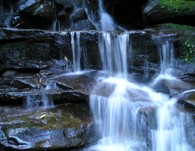
Have you ever seen a photo of a fountain or waterfall, where the water was smooth and blurred?  Or a photo of a city scene where the cars seemed to streak by in a blur of motion?  (See examples below.)

Smooth, blurred waterfall
From Waterfall by ~xPhate on deviantART

Blur motion
From digital-photography-school.com

Blur motion
From smashingmagazine.com

Or, on the flip side, have you ever seen a photo where a moving subject is frozen mid-action, and water may appear as individual droplets, rather than a smooth blur?  (See examples below.)

Frozen action shot
From boston.com

Frozen action shot
From cruzine.com

Well, those pictures don't just happen!  They involve a photographer intentionally changing settings on his or her camera to make the image either blurred, or frozen in time.  The settings that will effect this are called the shutter speed.

Shutter speed is the speed at which photo is taken.  For example, a shutter speed of 1/30 means that the photograph was snapped in one-thirtieth of a second.  The faster the shutter speed, the clearer and more "frozen" the image will appear; the slower the shutter speed, the smoother and more blurred the image will appear. 

Shutter speed chart 
From miketurner-photography.co.uk


Think about it this way: If a photograph is taken at a fast shutter speed (1/100, for example), then the image is being recorded for one-one-hundredth of a second; it is only recording what happened in that extremely brief fraction of a second.  It makes sense that that would yield a crisp, frozen photograph.  

Alternatively, if a photograph is taken at a slow shutter speed (2 seconds, for example), then the image is being recorded for that much time; it captures all the movement that takes place in that period.  The result is a blur. 

The differences between fast and slow shutter speeds

From exposureguide.com

From digicamhelp.com

Part 2: How to change shutter speed

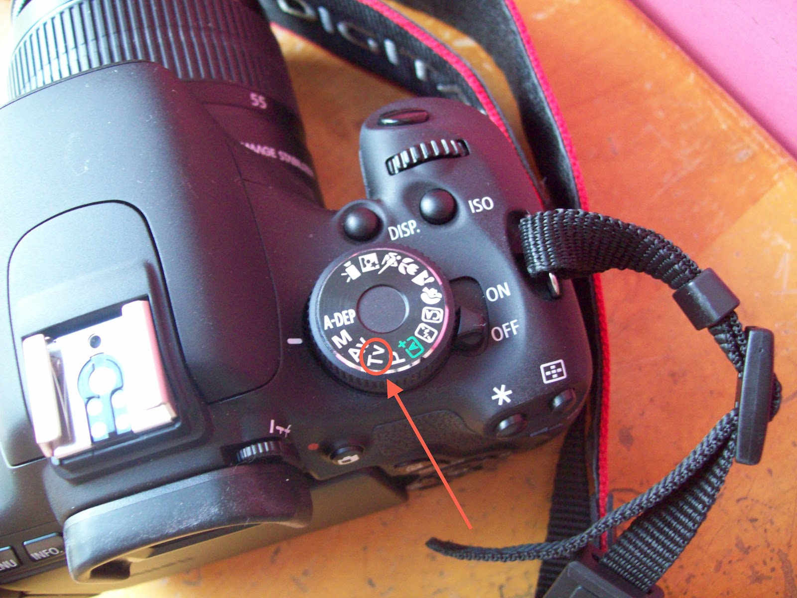
The way to change shutter speed on a Canon DSLR is by turning the Mode Dial to "TV" mode.


You can then change the shutter speed by turning the Main Dial, right behind the shutter button.  The changing shutter speed will display on the LCD monitor.


Part 3: Applying what we learned

You may be wondering: How fast or how slow should the shutter speed be?  The answer is... it depends!  While the chart above from Mike Turner Photography is definitely helpful, I will still say that the selection of shutter speed completely depends on what the photographer wants (do you want it to be frozen or blurred?), and on the setting and situation.  Experiment and see what you discover!

To illustrate the concepts of this tutorial further, here are some photos I took while experimenting with shutter speed for the first time. 

Fish tank bubbles


Notice how, as the shutter speed gets faster, the images get darker.  This is because the shutter inside the camera is opening and closing faster, which allows less light to enter the camera.  I believe the darkening effect of faster shutter speeds is counterbalanced by adjusting ISO, but that's a skill I still haven't learned, and it would be a topic for another tutorial!

Fireworks

I took these photos this Independence Day!  This first photo was taken with a really fast shutter speed (somewhere in the league of 1/200; I don't remember the exact number), causing the firework fountain's sparks to appear as individual particles, like bits of snow or dust.  Note also the light-sabers in the back that my brothers were swinging around, but do not look blurred.


Next I took pictures with a really slow shutter speed (again, I don't remember the exact number, but it must have been somewhere between 1/10 and 1"), and I had these fun, fountain looks.


Note how blurred the light-sabers are now!


Returning to a normal shutter speed (somewhere between 1/30 and 1/80) rendered an image that looks more like what we see with our eyes when watching a firework.


Conclusion

There are a lot of things you can do with shutter speed... go have fun with it!  Then, come back here for more photography tutorials, coming soon... and leave a comment about what you've been able to do with shutter speed.

Play safe and have a Happy Independence Day!